Property Management Portal (NPMP)
Case Study
Overview
The NIAID Property Management Portal (NPMP) was developed to improve the management of accountable property at the institute and individual level and to facilitate more efficient communication with the NIAID Property Office.
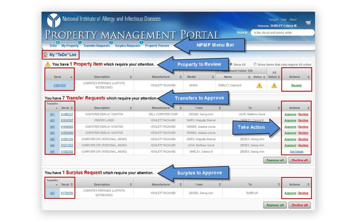
The original web application was a port from a desktop application. During its design phase, project stakeholders insisted that the new portal’s functionality and user interface mimicked its desktop predecessor as much as possible. Due to technology limitations and a few other factors, the resulting application ended up being unintuitive and cumbersome to use, requiring extensive training and documentation.
While a source of some annoyance, poor user experience did not become a major pain point until the administrators, the smallest percentage of the user base, seeking to lower their workload, began to offload some of the simpler tasks to general (untrained) users. Unsurprisingly, many of them, unfamiliar with the application, wound up contacting administrative users or management for assistance.
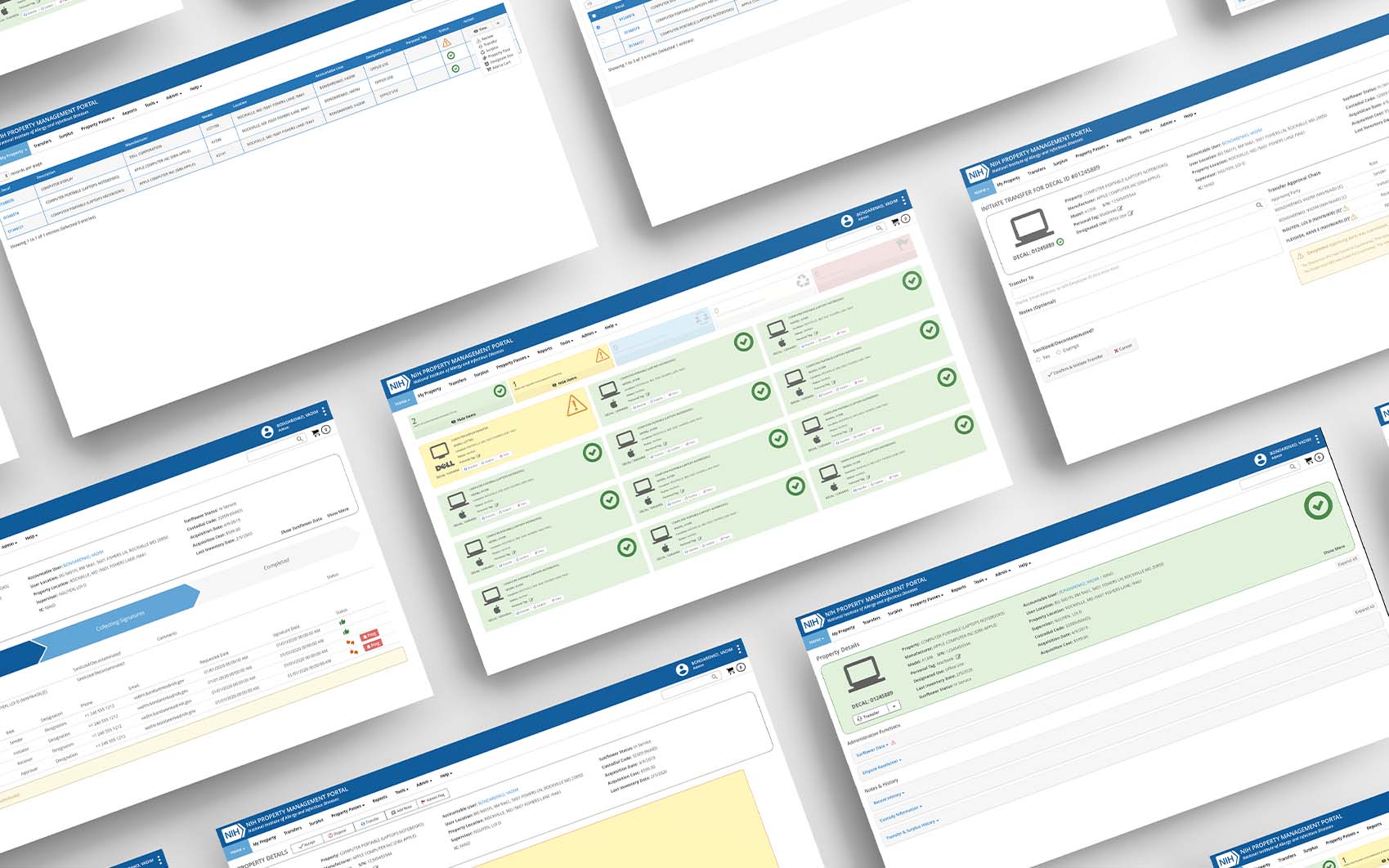
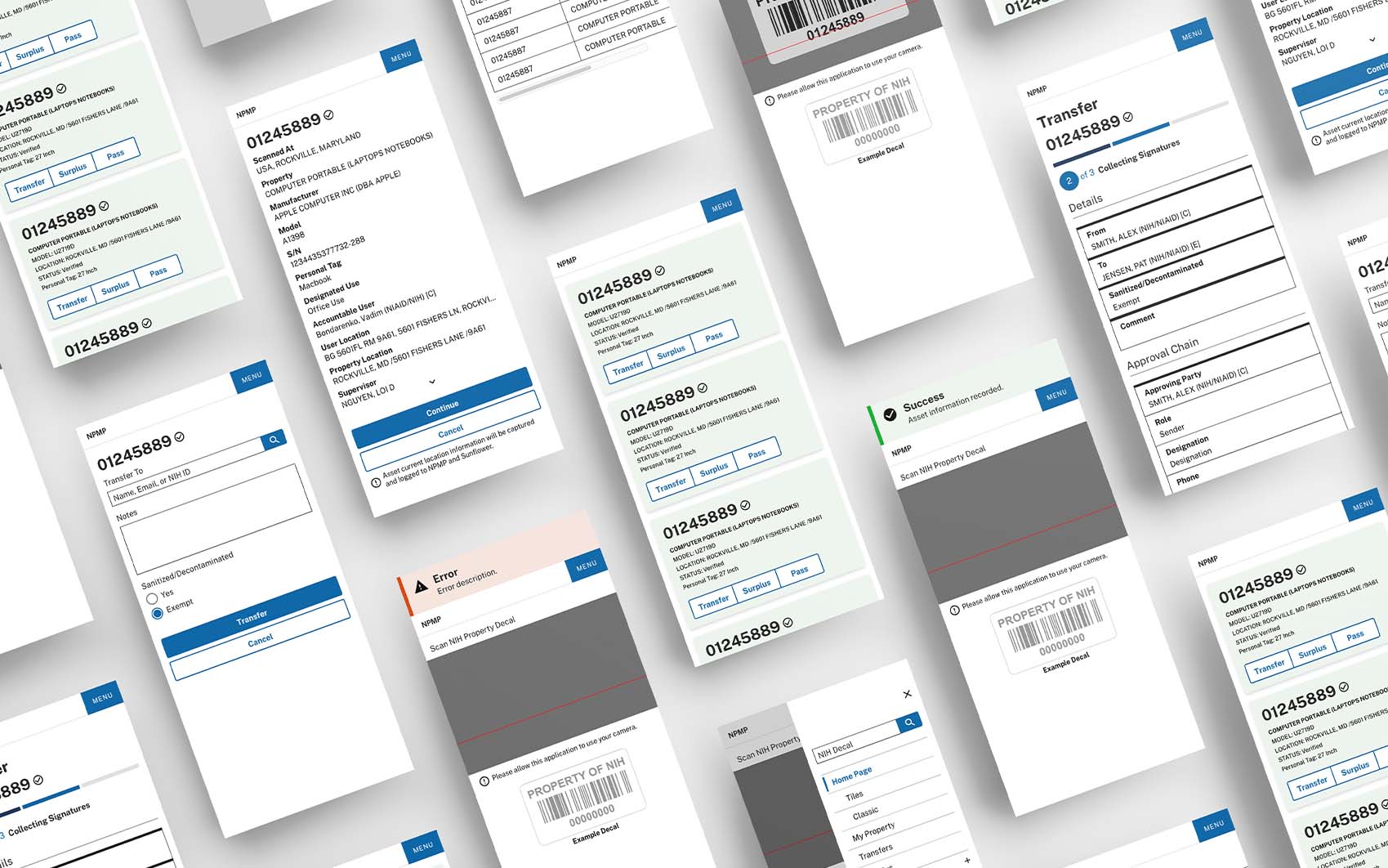
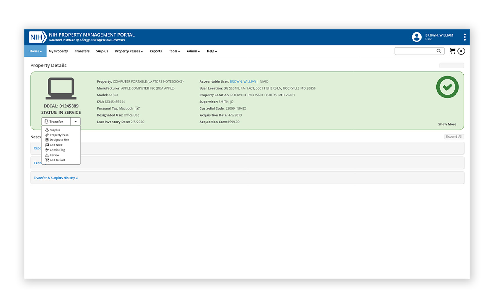
As the use of the application grew, so did the number of support requests. Ironically, it is aging software that prompted an overhaul of the system and not the users’ feedback or frustrations of the administrative staff. Fortunately, this time around, one of the goals of the new version was to simplify the user experience while also transferring the majority of simple tasks from administrators to property users.
CLIENT:
NIAID, NIH
YEAR:
2014-2016, 2022-Ongoing
Research, Analysis, & Compromise
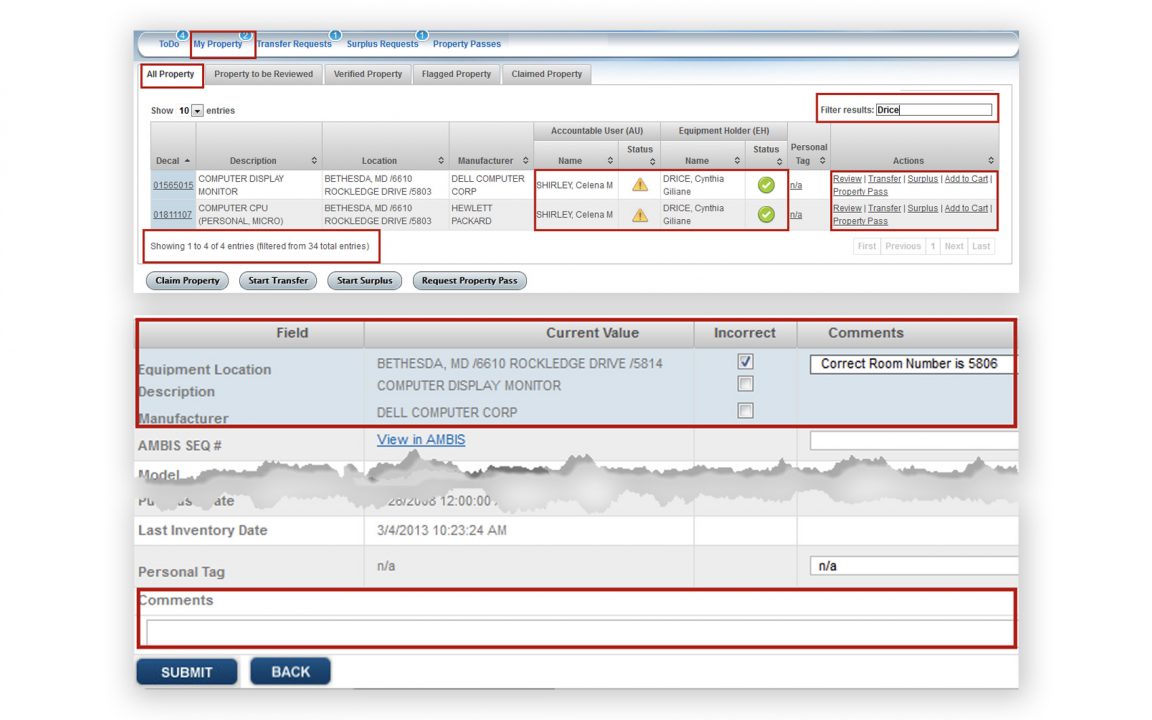
Initially, my assignment was to update the existing user interface to make it more user-friendly or, in my project manager’s own words, “make it look pretty.” However, it quickly became clear that simply polishing the interface would not do. The single screen, catch-all scenarios interface, was designed to serve only a small fraction of the user base. This group also happened to be the power users, people who used the system daily and were intimately familiar with the process. Many of them were also heavily involved in the original system design. And, despite its many imperfections and over-complexity, were very much reluctant to change anything about it. That, unfortunately, left 90% of the user base who used the system sparingly with an application they did not understand or cared to learn.
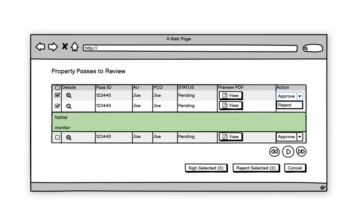
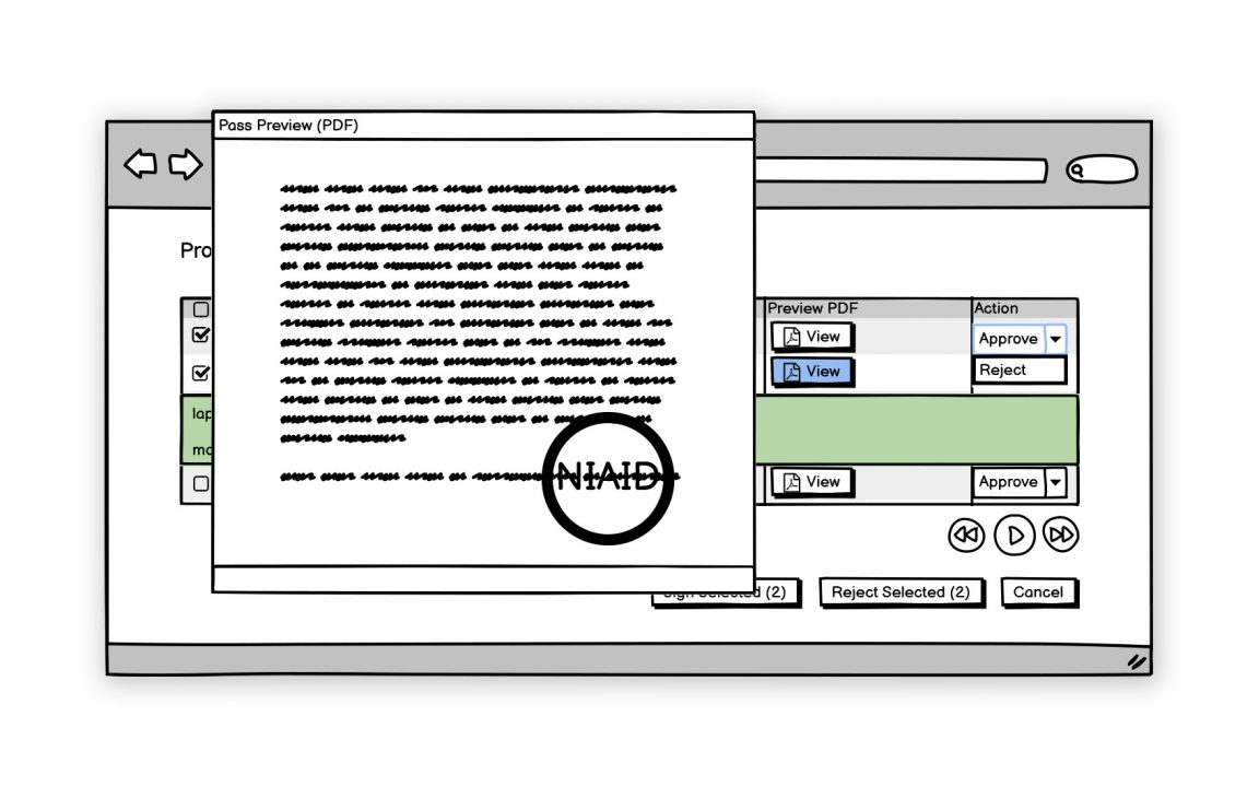
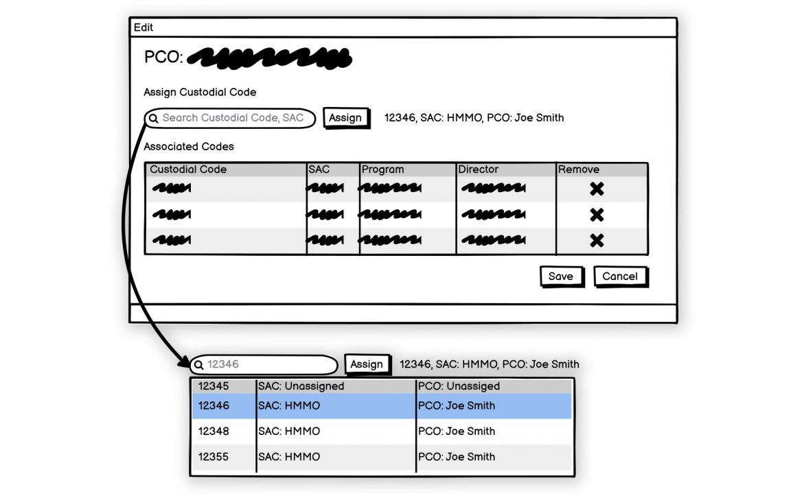
With these findings in mind, my initial solution was to separate tasks and declutter everything, make the system intuitive enough to not require any training. To achieve that I proposed to break up the application into dedicated views, based on scenarios (beyond security roles), that would only include elements required for a user to accomplish a specific task. Ideally, for the aforementioned 90% of users, this should be a one or two-click process. Perhaps a little more for the power users. Being new to the organization, I was taken aback when my proposed solution was immediately shut down by the project manager. Interoffice politics never occurred to me. The issue was that while this approach was sound, it would never be accepted by the power users who were adamant on keeping things as they are. In the end, we agreed with a parallel solution, a simple interface for most users, and an advanced view for others.
Adapting Design Process to Customer Preferences
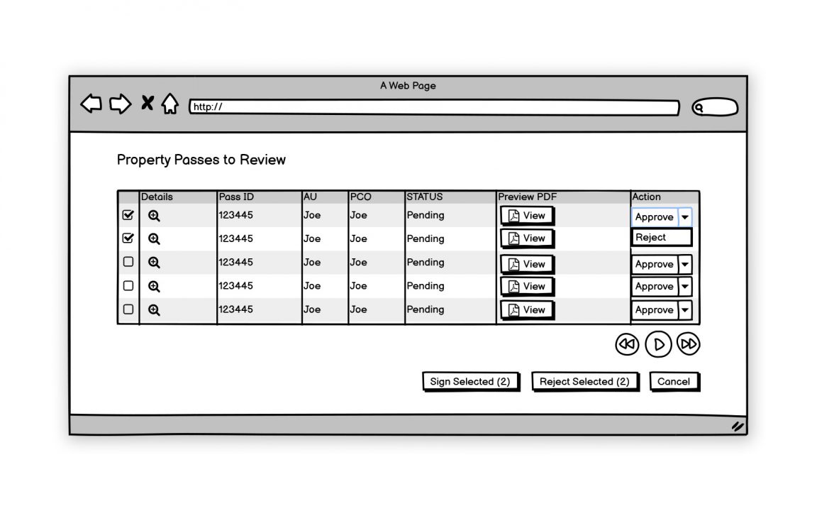
Typically, sketching and wireframing using rapid design tools would be the next step of the process. To my dismay, I found out that traditional ways to present and discuss the ideation process did not quite work in this environment. Our customers or even some developers did not understand respond well to static lo-fi wireframes or sketches. That and the lack of other licensed prototyping tools forced me to start creating fully styled and Javascript enabled HTML prototypes. Although a straight to HTML approach moved the conversations along, it was much more time consuming than typical prototyping process. As a result, I did not get a chance to explore and test alternative visual or structural designs as much as I would have liked.
New Design & Future
In the end, I was able to deliver a streamlined and simplified user experience for the majority of the user base, while also accommodating the power users. The new version of the application was launched at the end of 2016.
Project Update: After the initial roll out, the application received such a positive response that it prompted several other NIH institutes to adopt it. By 2019, the portal was rolled out to the entire NIH. Of course, as the application’s user base grows and technology evolves, needs for new features, updates, and improvements arise. In early 2022, planning for a new version of the portal has begun.